When planning a responsive website design, it is helpful to see which media query breakpoint is currently being displayed in your browser. There are a few methods that one can implement in the css to display the widths when a breakpoint is triggered, one method is to use background colors – one color for each of the screen widths. Another method is to “fix” the css pseudo-element ::after paired with a class or id to cause the breakpoints to always display.
More Information
Media Query
@media only screen and (min-width:1366px) and (max-width:1919px){

/* Add CSS for the breakpoints here */

}
Above – a Media Query –
- notice the use of min-width and max-width (breakpoints) in parenthesis
- notice the use of the word and
- notice the opening and closing curly braces
Reference: http://www.w3.org/TR/css3-mediaqueries/
——–
CSS Pseudo-element ::after
Within the various media queries, add the CSS pseudo-element ::after.
- Choose a class or id for an element that is used within your css and used by every webpage in your website.
In my example code I selected #bottom.
Note- You might have to experiment to find the right id or class element. I ended up using the last element listed on my pages. - Enter the syntax properly –
#bottom::after { content:" the widths"; } - Add before the closing curly braces
position:fixed; left:10px; bottom:10px;
Adjust the left and bottom values if necessary. - Additional styling may be entered before closing curly braces.
Reference: http://www.w3schools.com/css/css_pseudo_elements.asp
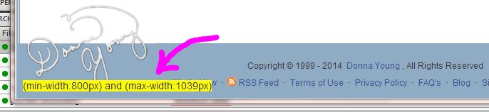
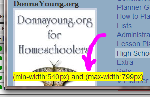
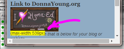
Result is Shown in Images Below
See also this example page: https://donnayoung.org/blog/rdd-pseudo-element-after.htm
Pseudo-element and Media Query CSS
Add to the bottom of your css file and …
- Change #bottom to your class or id
- Change the width breakpoints to your breakpoints
A TEXT file of the CSS listed below
@media only screen and (min-width:1920px) {
	#bottom::after {content:"(min-width:1920px)";
	background:yellow;
	position:fixed; left:10px; bottom:10px;}
}

@media only screen and (min-width:1366px) and (max-width:1919px){
	#bottom::after {content:"(min-width:1366px) and (max-width:1919px)";
	background:yellow;
	position:fixed; left:10px; bottom:10px;}
}

@media only screen and (min-width:1280px) and (max-width:1365px){
	#bottom::after {content:"(min-width:1280px) and (max-width:1365px)";
	background:yellow;
	position:fixed; left:10px; bottom:10px;}
}

@media only screen and (min-width:1040px) and (max-width:1279px){
	#bottom::after {content:"(min-width:1040px) and (max-width:1279px)";
	background:yellow;
	position:fixed; left:10px; bottom:10px;}
}

@media only screen and (min-width:800px) and (max-width:1039px){
	#bottom::after {content:"(min-width:800px) and (max-width:1039px)";
	background:yellow;
	position:fixed; left:10px; bottom:10px;}
}

@media only screen and (min-width:540px) and (max-width:799px){
	#bottom::after {content:"(min-width:540px) and (max-width:799px)";
	background:yellow;
	position:fixed; left:10px; bottom:10px;}
}